
Read frequency before labels
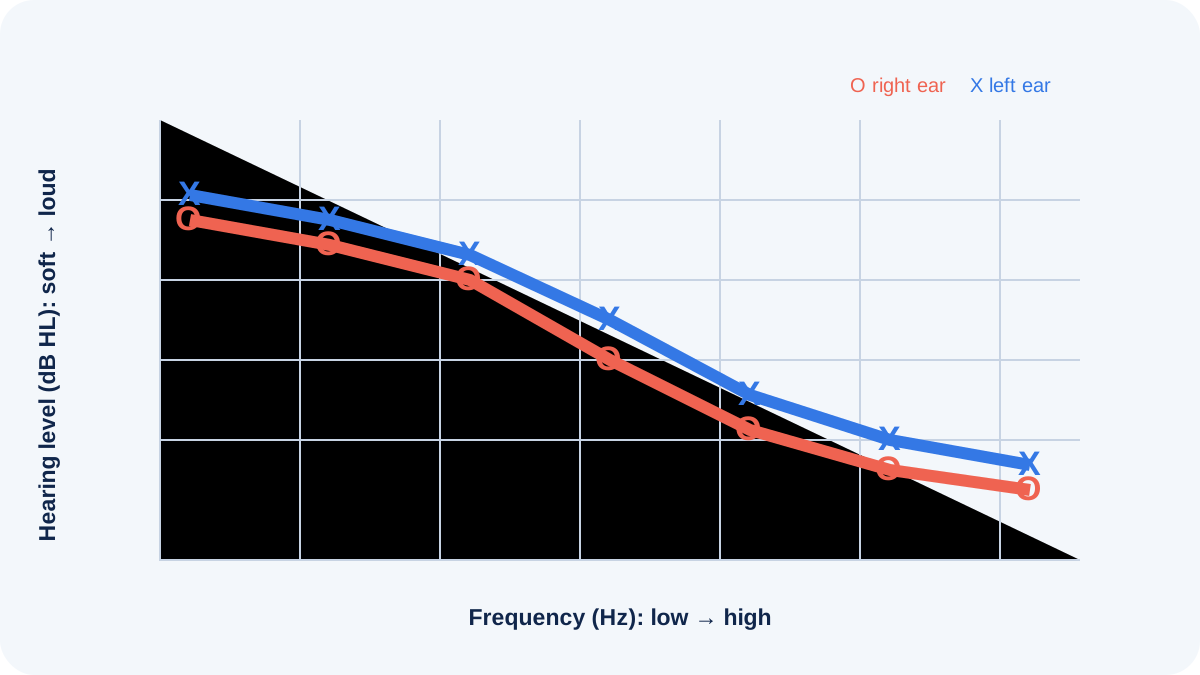
An audiogram places frequency from low pitch on the left to high pitch on the right. Hearing level runs from softer near the top to louder farther down. Symbols show the softest tones detected for each ear and test route. A line connecting them makes the pattern easier to see, but the measured points—not the artistic line—are the evidence.
Check the key for right, left, air, bone, masked and unmasked symbols. Printed reports can use different conventions.
What degree labels summarize
Terms such as slight, mild, moderate, severe and profound group ranges of hearing level. Cutoffs vary among references and populations, especially around category boundaries. A person may have more than one degree across frequencies, so “mild hearing loss” can hide a steep high-frequency reduction.
Degree is not a percentage of hearing and does not predict communication by itself. Speech audibility, clarity, noise, visual cues, language and the task all matter.
Common configuration words
A flat configuration remains relatively similar across tested frequencies. Sloping patterns become poorer toward higher frequencies; rising patterns improve toward higher frequencies. A notch shows a localized reduction with recovery on either side. Cookie-bite describes poorer mid-frequency thresholds, while reverse cookie-bite describes relatively better mid-frequency thresholds. These words describe shape, not cause.
Asymmetry means the ears differ beyond the clinic’s criteria and may require focused interpretation or referral.
Connect shape to speech carefully
High-frequency reductions can reduce access to many consonant cues while lower-pitched vowels remain more audible. That can make speech seem loud enough but unclear. Low-frequency changes can affect vowel information and fullness. Real speech spans frequencies and levels, and people use context and visual information, so no audiogram can be translated into an exact sentence someone will or will not understand.
Worked examples
A gently sloping bilateral pattern may support discussion of amplification, but candidacy still depends on needs, health, preferences and verified benefit. A new one-sided drop may trigger medical questions even if the average degree looks modest. A notch in someone with noise exposure is a clue, not proof that noise caused the result.
The strongest interpretation joins configuration with air–bone relationships, speech measures, tympanometry, symptoms, timing and prior tests.
Use labels for planning, not identity
- Ask for the thresholds and symbols, not only the category.
- Identify which daily tasks are affected.
- Compare with prior results using the same ears and frequencies.
- Ask whether asymmetry or rapid change needs follow-up.
- Judge technology with verified settings and real-world goals.
People may use Deaf, hard of hearing or another identity term independent of an audiogram category. Respect the person’s language and communication preferences.
Why averages can mislead
A pure-tone average commonly combines selected speech frequencies, but the selected frequencies and calculation can vary. Two audiograms can share the same average while one is flat and the other has nearly typical low-frequency thresholds with a steep high-frequency drop. Those patterns can create different speech-access problems and different fitting constraints. A single “percentage loss” derived from an average is especially easy to misuse.
Ask which frequencies were included and why the summary is relevant to the decision being made. Disability, compensation and occupational systems may define their own formulas; those administrative calculations are not universal descriptions of communication ability. For day-to-day planning, ear-specific configuration and functional examples are usually more informative.
Track change responsibly
When comparing audiograms, use the original graphs and dates. Confirm that the same ear and symbol are being compared, note transducer and masking differences, and allow for ordinary test–retest variability. A small shift at one frequency may not be meaningful, while a consistent change across neighboring frequencies or a new asymmetry may deserve attention. The clinician can decide whether reliability, calibration, middle-ear status or a genuine change best explains the pattern.
Do not delay care while trying to classify a graph. Sudden hearing reduction, marked one-sided change, neurologic symptoms, severe pain, drainage or acute dizziness require prompt professional assessment. For stable results, choose two or three real situations—such as a team meeting, television or conversation in a car—to judge whether strategies and technology improve participation.
Sources and review notes
Sources were checked for this editorial update on October 12, 2026. External guidance can change; follow the linked source for the current version.
This page provides education, not an individual diagnosis, treatment plan, legal opinion or billing decision. Historical expert contribution is credited only where supported by the original project record; it does not imply review of this update.